Announcing the release of the V2 Technology Platform
Published on: 11 July 2024
The Urban Analytics team has made significant strides with the Technology Platform over the past six months, consolidating its resources, enhancing its tools, and planning for future developments.
This blog post will summarise the latest progress, categorised under: “What’s new,” “What’s improved,” and “What’s next”
- What’s new
- Popgetter v0.2 release
- clim-recal: a climate bias correction dataset for three cities
- Vulnerable Populations Explorer
- App templates
- New ways to access SPC
- New tools for working with GeoJSON
- Polygon widths
- Demoland: now UK-wide with new experimental features
- Demoland: experiments
- Results from the research on computer vision for public good and disaster relief
- What’s improved
- What’s next
What’s new
We have added several new components to the platform as well as a few new applications for end users.
Popgetter v0.2 release
In the process of building the various applications and components on the platform, we almost always hit the challenge of needing to source high quality information about what populations live where.
This is not a trivial matter especially if we want our solutions to be portable to new regions and countries.
Popgetter is our answer to this problem. It’s a new component that seeks to lower the friction of accessing fine grained census data at a range of geographic scales and countries.
It consists of two parts:
- A pipeline, written using the Open Source Tool Dagster, which allows us to process census data from a number of countries.
- A library and command line application to easily request exactly the population data you want in a region at a specific geographic scale.
We currently support the UK (Scotland, England, North Ireland and Wales), Belgium, and the US.

If you’re interested in having your country in Popgetter, we would love to work with you – reach out and we can help you through the process!
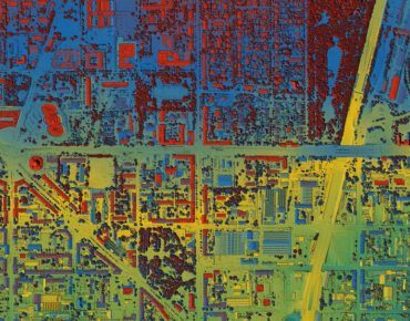
clim-recal: a climate bias correction dataset for three cities
Climate change, and the increase in frequent extreme weather events, is one of the largest challenges that urban areas will face over the next 30 years.
One of the key tools to understanding how climate will change in the future is large physics-based simulations. The Met Office provides a number of these down to a 2km grid scale, which could help us understand and prepare for climate change at the city scale.
Unfortunately, for a number of reasons (limited spatial resolution, simplified thermodynamics, etc), the projections at a small scale can be systematically off. Bias correction is a suite of methods that aims to correct these systematic errors by comparing simulations to historic observations of the climate. It uses the discrepancies between the simulation and the models to find ways to correct them that can be applied to future predictions.
There exists a large number of different ways of doing this kind of bias correction and it’s hard to know which to apply when, especially for non-climate experts. These methods also need the historic data and simulations to be aligned both spatially and temporally.
That’s why we are releasing a set of combined observation and simulation datasets for three cities in the UK and inviting authors of bias correction methods to benchmark their methods for those cities. We will be providing sample results soon on our Exported Datasets page.
Vulnerable Populations Explorer
Understanding how climate will affect people in the future requires us to understand, not just the hazards they will face (extreme temperature), but also who is vulnerable to those hazards and who will be exposed to them.
This requires us to combine projections of climate change with fine-grained population, building, and health data and make that information accessible to people working in health and policy while ensuring individual privacy.
We are launching an early prototype of the Vulnerable Populations Explorer; a tool that aims to combine projections on which areas are going to be hit by extreme weather events with our Synthetic Population Catalyst (SPC).
We are working on getting an interactive version of the site live but, while you wait, check out this video to see what the tool does and check out the code on github.
If you’re interested in helping us develop this more, have a use case for it, or want to give us feedback, please drop us a line or feel free to open an issue on github.
App templates
Communicating the results of our work to a large array of stakeholders often requires us to develop interactive dashboards and web-based tools. As we have built these tools for a number of different projects, we have started noticing common patterns and requirements. Our applications often have similar layouts, interaction models, and processing requirements and so, to accelerate our ability to produce new tools as quickly as possible and to more easily maintain existing tools, we have started developing a set of application templates. These currently consist of:
- A web application written with Svelte.
- Common layouts for our applications.
- Optional Rust and Python backends which are run in the browser using WebAssembly.
- Examples of charts and graphs.
- Common UI styling.
We think these templates are a good starting point for anyone who might be interested in building urban analytics applications and so we are making them available to the wider community to use and improve on.
The template source code is available on GitHub, but you can get started more quickly by running in your terminal:
npm create @uatp/web@latest
As part of this work, we have been helping build some features upstream into the svelte-maplibre library that powers our maps. It’s a great project that we have loved contributing to.
New ways to access SPC
The Synthetic Population Catalyst (SPC) (paper, website, github) provides a synthetic population of individuals and households for Great Britain (GB), including socio-demographic, income, health, and daily activity features, as well as future populations through projections.
To make it easier to work with SPC outputs, we have added two new features:
- Parquet outputs: we’ve included new serializers to enable output in columnar parquet format. Parquet is designed to efficiently deserialize into the efficient Arrow memory layout. As an example, for West Yorkshire, peak memory usage and time-to-load drop from 11GB and 6 minutes down to 2GB and 2 seconds working with the new parquet output, as well as enabling previously challenging areas to load (such as Greater London), to be loadable in 10-20 seconds.
- SPC toolkit (
uatk_spc): we created a new Python package that simplifies reading and working with SPC outputs. You can now read protobuf or parquet populations directly from local file paths or a URL, as well as build dataframes from the fields of the population to produce customised datasets as needed.
Further documentation and example notebooks demonstrate the new features and show how the SPC toolkit can be used to read and build populations for data science and machine learning analyses. Please reach out and open an issue if there are improvements or new features you would like to see in the SPC toolkit!
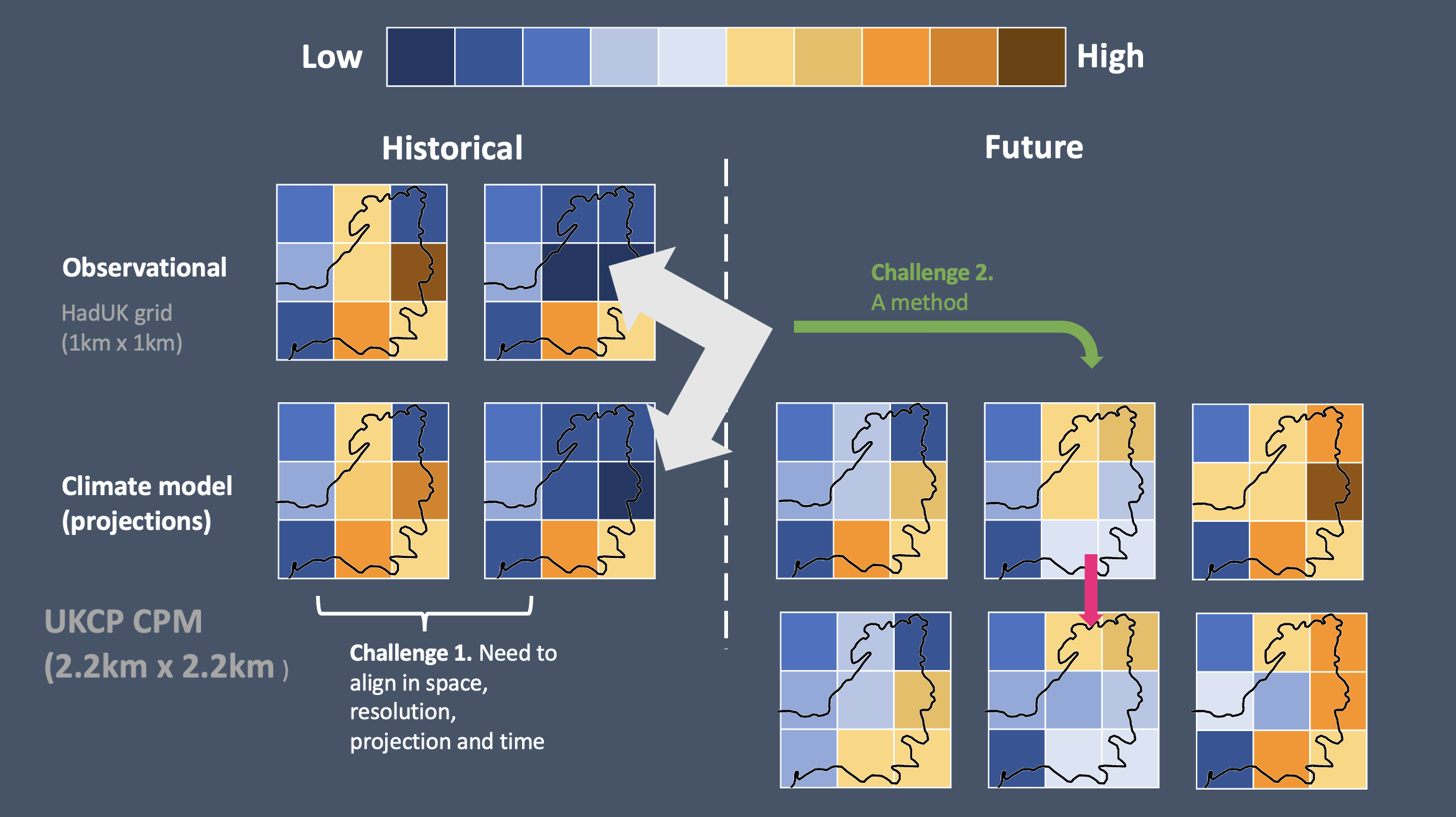
New tools for working with GeoJSON
Developed partly during Turing UA hackathon days, two exciting new “day-to-day” tools now make it easier to work with GeoJSON files:
- GeoJSON viewer: aiming to fill the gap between geojson.io (missing features such as filtering, slow for large input) and QGIS (overpowered and hard to use), GeoJSON viewer empowers users with a fast viewer allowing them to filter and colour by attributes to spot real examples of features quickly.
- GeoDiffr: enabling users to compare two GeoJSON files and visually identify the differences between them. Example use cases include comparing the outputs of different routing algorithms or exploring how areas of interest have changed over time in OpenStreetMap.
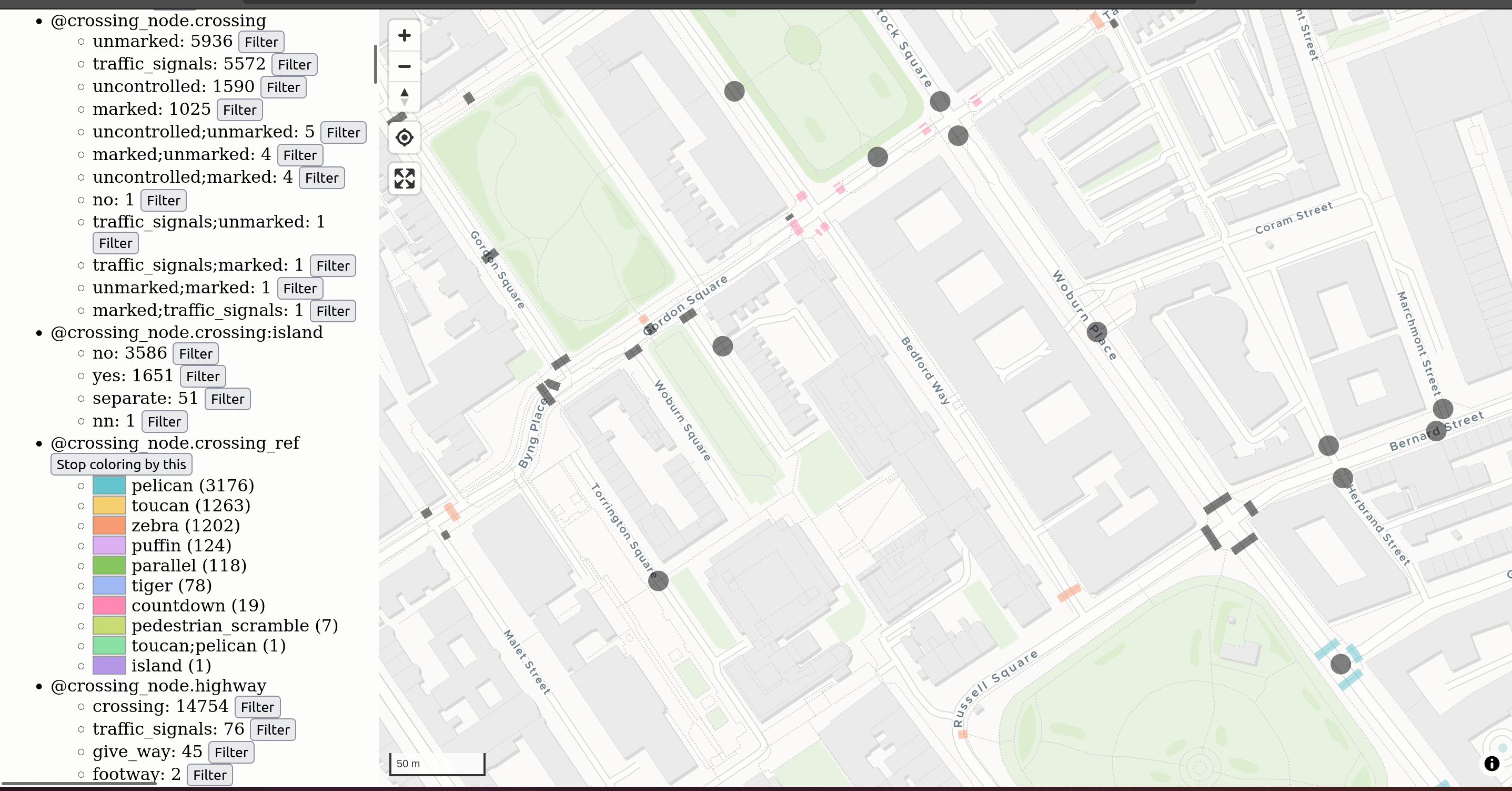
Polygon widths
Understanding road geometries and road widths is essential for planning decisions for building dedicated walking and cycling infrastructure. Doing this in a performant way with existing tools can be challenging.
We’re excited to announce a new tool yet-untitled polygon width tool built in Rust with a simple web viewer to allow quick debugging of your particular input. If you have a GeoJSON file or you can draw your polygon, it’ll take you seconds to try this algorithm out on your data.
For more details on these exciting developments, see this recent blog.
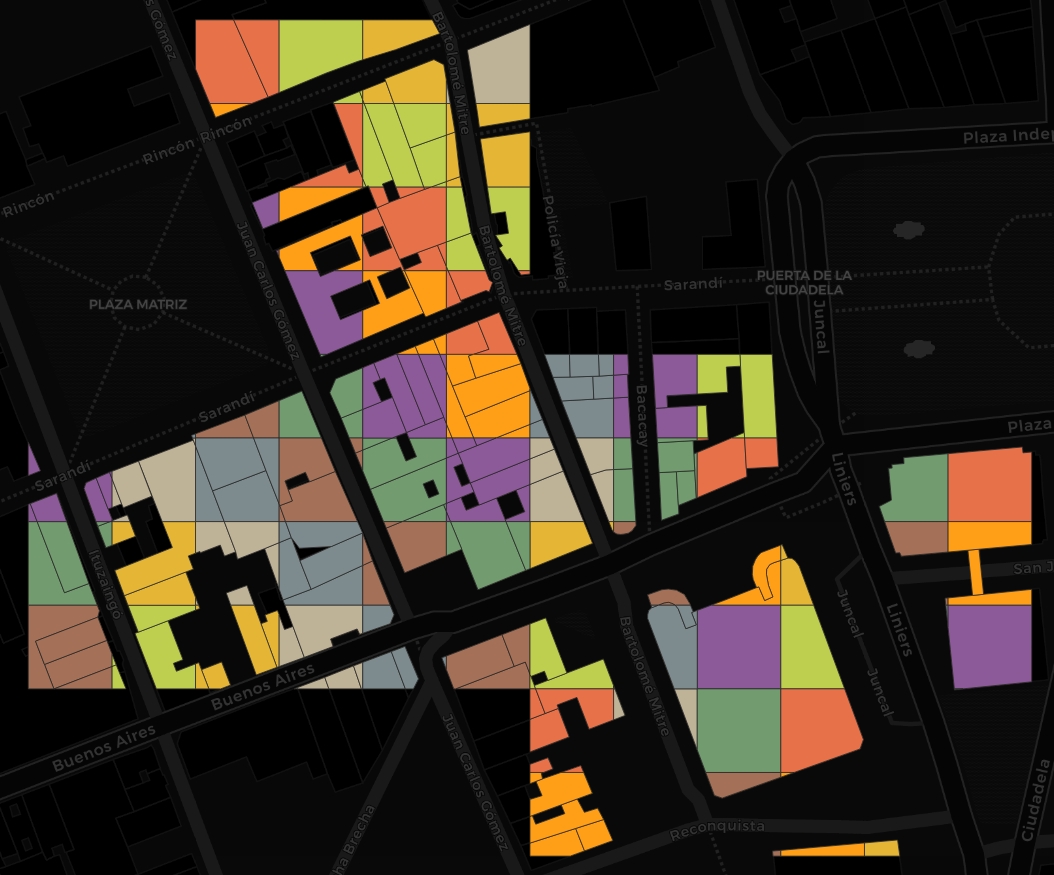
Demoland: now UK-wide with new experimental features
Demoland is our prototype tool for exploring the strategic trade-offs that come with land use planning decisions. Built in collaboration with the Geospatial Commission and Newcastle City Council, it allows users to change land use signatures and see the predicted impact of those changes on four quality of life metrics (house prices, access to jobs, access to greenspace, and air quality).
Though initally built for Newcastle, we have been hard at work developing a pipeline that allows us to spin up a Demoland app for any part of the UK. You can check out a version of the app for the Isle of Wight running here. If you are interested in running Demoland for your local area, reach out to us to let us know. You might also notice another new feature in this demo: hex bin geographies. Now users can choose between the Urban Grammar geometries that were part of the original Demoland and the hex bin geometries you can see here.
Users can now also generate their own scenarios, see the impacts of those scenarios, and share them with others.
Demoland: experiments
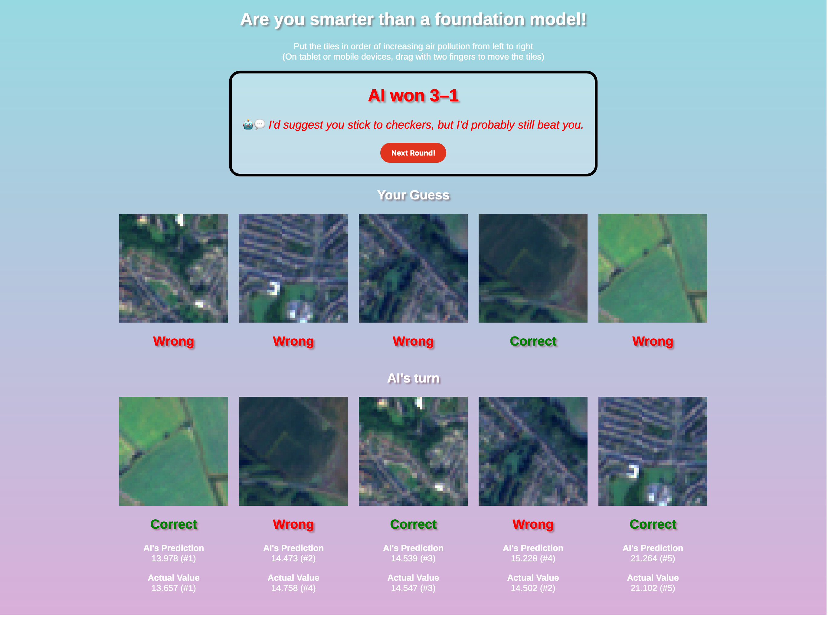
Recently, we have been working with the Geospatial Commission to explore how new AI-based approaches might impact land use planning. We have been focusing on using satellite imagery along with foundational models as complementary data for the input to the Demoland model. We have been surprised at how well this has worked in producing accurate predictions for air quality, so much so that we built a small game for people to try and beat the model. It’s harder than you might think!
We have also been exploring how large language models (LLMs) may provide a complementary interface to understand scenario changes. To do this, we developed a geospatially-aware LLM agent that is capable of answering a user’s question about the scenario they produced in Demoland. This agent has access to Python for spatial and non-spatial calculations, a number of contextualising datasets and the open street map overpass API to lookup features. We were surprised at how well the LLM did at answering in-depth questions. You can see it in action here:
Results from the research on computer vision for public good and disaster relief
Within the partnership with HOT - Humanitarian OpenStreetMap Team, a workflow was built to assess the performance of their growing web app fAIr. fAIr is an open source AI-assisted mapping tool to generate semi-automated building footprints features from aerial imagery. In the web app, OpenStreetMap (OSM) users can create their own local training dataset, train/fine-tune a pre-trained Eff-UNet model (for more details, see the RAMP initiative), and then map into OSM with the assistance of their own local model.
The recent research question we have been investigating is how accurate fAIr is in detecting buildings and how it performs in different contexts. For example, do factors like the type of roof cover, the buildings density, urbanity type or regional factors affect the training performance?
We have tested fAIr on 25 cities around the globe and compared the currently used training/validation accuracy metric (categorical accuracy) against 4 other metrics relevant in image segmentation studies: precision, recall, F1 score, and intersection-over-union (IoU) (see fork of fAIr-utilities). The results were presented at ML4EO 2024 - Machine Learning for Earth Observation Workshop in Exeter in June, see below our winning entry for the image competition!
More on this to come in an upcoming related blog post.
What’s improved
Making SPENSER faster
Building on SPENSER, in the UATP microsimulation fork, we have re-implemented part of the model to enable faster runtime, while maintaining the same underlying algorithm to enable it to be used as a drop-in substitute.
With improved performance, the work aims to facilitate the generation of ensembles of populations for uncertainty and scenario modelling, for example, for use as a base population for the Synthetic Population Catalyst.
For further details, a quickstart guide, and benchmarks, see the README.md introducing microsimulation-rs.
What’s next
Activity-based model (AcBM) for SPC
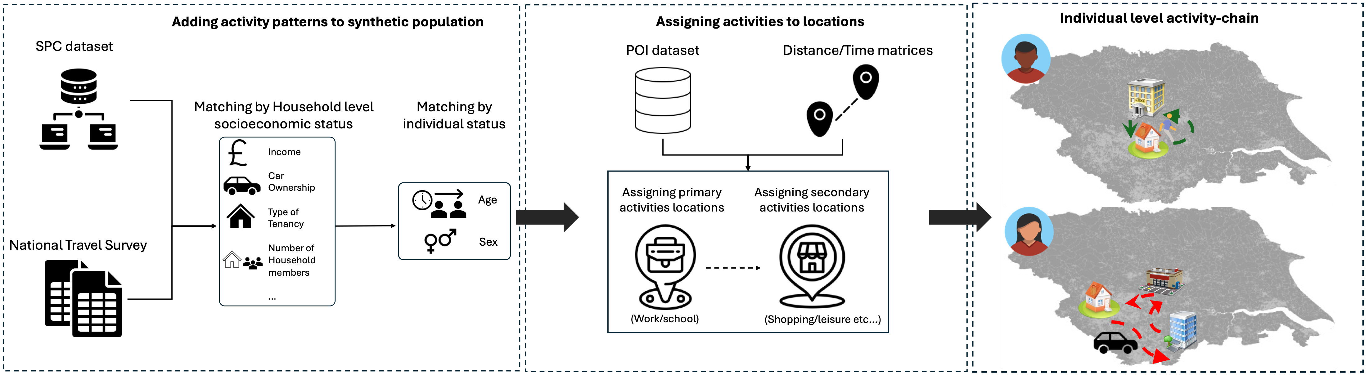
The SPC described above in our update with the new SPC toolkit includes daily diaries for capturing how people spend their time, e.g. proportion of time at work, school, or retail venues. However, more fine-grained detail about both the order in which they complete their daily activities and how they complete them (e.g. car, walk, bus) is missing. Understanding this can help us better understand how people spend their time, which can be useful for a wide range of applications such as transport demand modelling.
As such, we are developing the Activity-based Model(AcBM), a pipeline aiming to extend the Synthetic Population Catalyst (SPC) for transport demand models. It will combine the National Travel Survey (NTS) with SPC population members through matching and then assign venues for the activities in schedules from the NTS to derive spatial trajectories associated with schedules for individuals.
For more details, check out the AcBM documentation.
LLM toolkit
We learnt a lot by integrating a chatbot-like interface into Demoland and we want to make building similar interfaces in future as easy as possible. To do that, we are currently working on a geospatial LLM agent and geospatial LLM toolkit. This toolkit will allow us and others to use a number of LLM techniques such as Retrieval Augmented Generation and Chaining and Function Calling in concert with a suite of tools that will allow the LLM to perform spatial computations, understand the context of a space, and interact with external knowledge stores to build geographically-aware agents for a wide variety of different tasks.
We think there is a lot to explore in this area so watch this space.
Popgetter v0.3
With the release of Popgetter v0.2, we are making it easier for our projects to access census data from multiple countries in a consistent and predictable way. There is, however, so much more we want to do with Popgetter. Over the next few months, we are planning on adding even more data: expanding the number of countries covered, adding data products for the existing countries, and exploring other types of data that we can bring into the platform.
Beyond census data, two high priorities datasets we are planning on working on next is the data that went into producing the Urban Grammar signatures, along with the signatures themselves, and our synthetic population data from the SPC project.
On the tooling side of Popgetter, we are planning on building a number of different ways for users to interact with the platform. To make it easier to find and create a list of the datasets you want from Popgetter, we are planning to build out a terminal user interface and web interface. We also think there is great utility in making Popgetter available in the data science and web tooling contexts. To enable those use cases, we will be developing Python and JavaScript interfaces for the Popgetter library.
More on computer vision for public good and disaster relief
Future plans for fAIr include the extension to detect other features, such as land use and water bodies. Also, the implementation of other ML backbones architectures during training is currently being investigated. The research will then be extended to assess how fAIr performs for these new data and models.